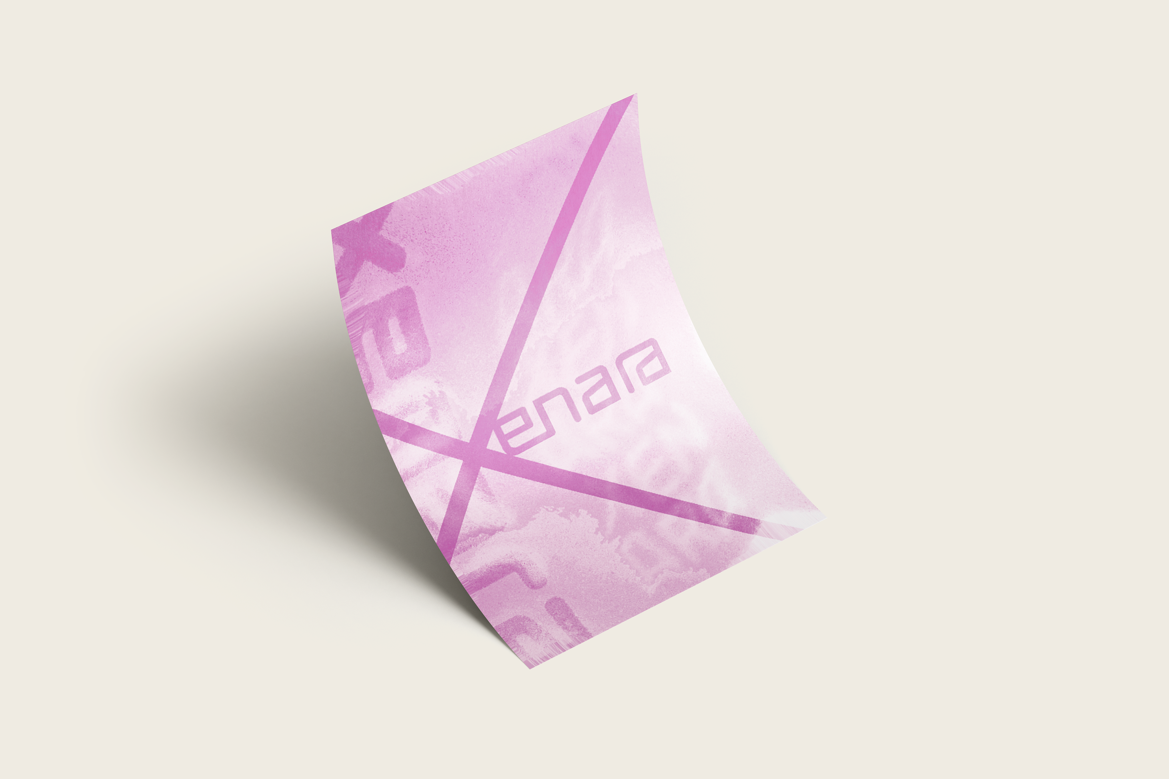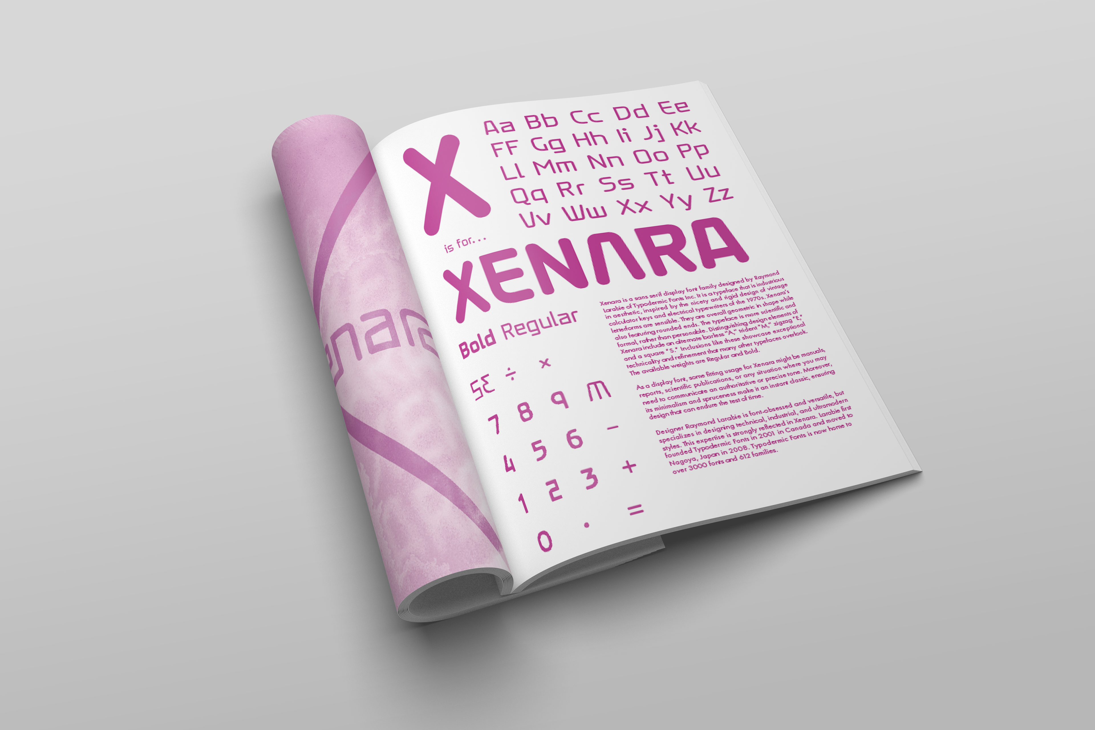
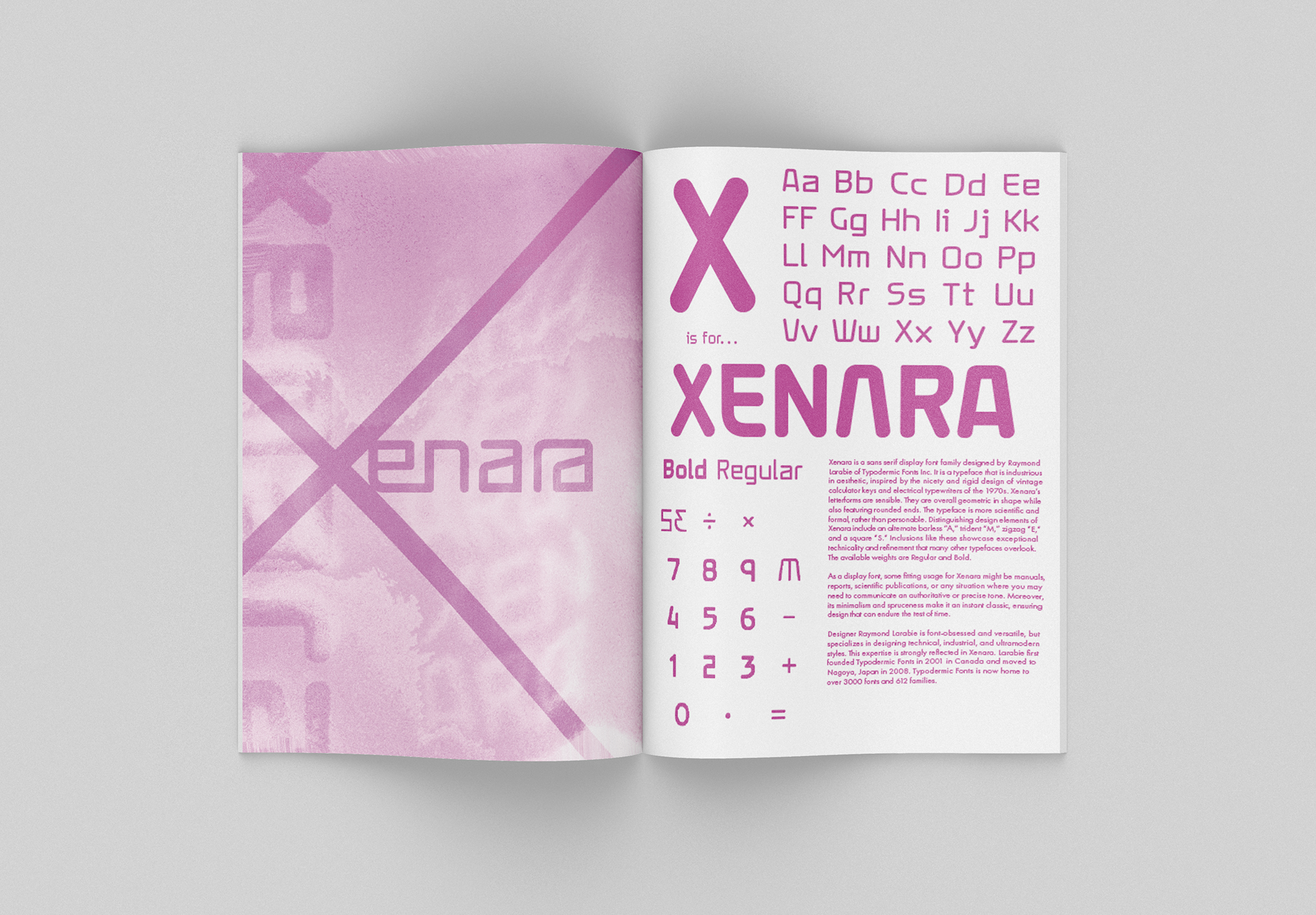
As part of a collaborative alphabet book project, I participated in designing a spread dedicated to a single typeface corresponding to a letter of the alphabet. Assigned the letter X, I selected Xenara, a typeface designed by Raymond Larbie for Typodermic Fonts. The spread explored the distinctive personality of the typeface through a series of playful yet intentional design decisions. One of the most engaging elements was arranging the numerical characters in the format of a calculator display, referencing the digital and geometric qualities that inspired the type design itself. I also incorporated Xenara’s alternate characters throughout the composition, allowing the spread to fully showcase the typeface. The hero image presented a particularly rewarding challenge, because the design relied entirely on typography, without the use of illustration or photography. This limitation encouraged me to push the type and experiment distortion. By treating the letterforms themselves as graphic elements, I was able to build a composition that felt energetic and engaging while still remaining rooted in typographic design. The exploration translated naturally into a complementary poster design, where the exploration could be displayed on a larger scale.